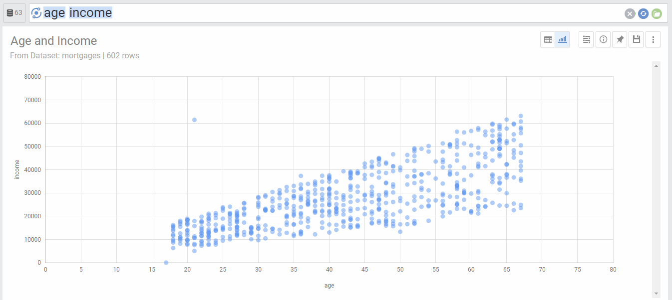
Summary: Scatter charts are useful to plot unaggregated data points to show any relationship between two columns.
Scatter charts plot the values of two metrics across the X and Y axis. This is useful to show if there is any relationship between the two columns. Your data needs to have at least 2 metrics to be displayed in a scatter chart.
You can also have one dimension in addition to the two metrics. In this case, the chart will color the dots according to the dimension. For example, below is the above chart when we add the region dimension
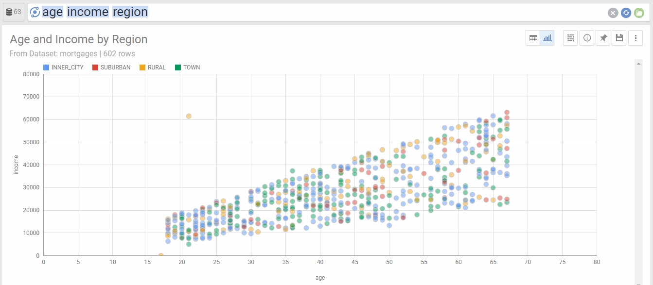
Chart Options
| Option | Explanation |
|---|---|
| X Axis | The Metric used for X axis |
| Y Axis | The Metric used for Y axis |
| Color | The Dimension used to segment the data points by color |
| Numbers Format | Change the format of the numbers used in the Axes and on-hover data call-outs of the chart. |
| Legend Location | Select the location for the legend that shows the color coding of the data points |