Summary: Bubble charts can display up to 5 columns of data represented by the X axis, Y axis, Size of Bubble, Color of Bubble and Label for each bubble.
Bubble charts are a variation of Scatter charts where the data is represented by bubbles with different sizes and colors. Bubble charts can plot up to 5 columns having at least 3 metrics. The elements used to represent the 5 columns are : X axis, Y axis, Size of Bubble, Color of Bubble and Label for each bubble.
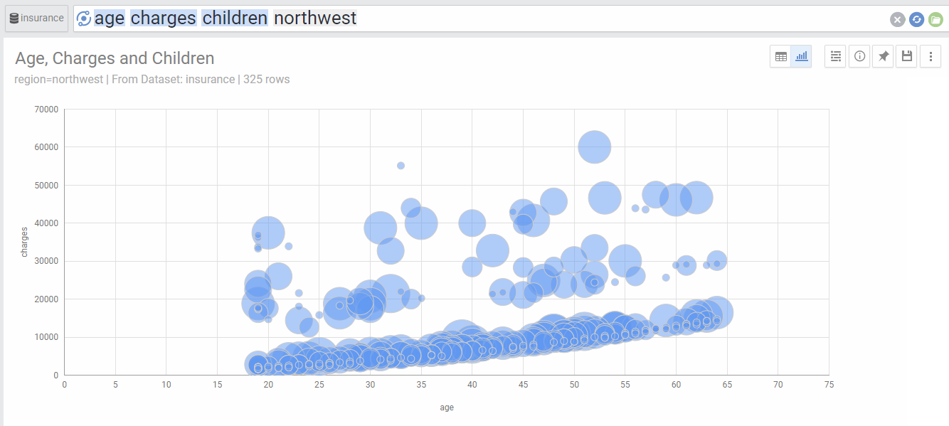
In the case of three metrics, the bubble chart will show bubbles with the same color, with the X axis,Y axis and Size of bubble representing the three metrics:
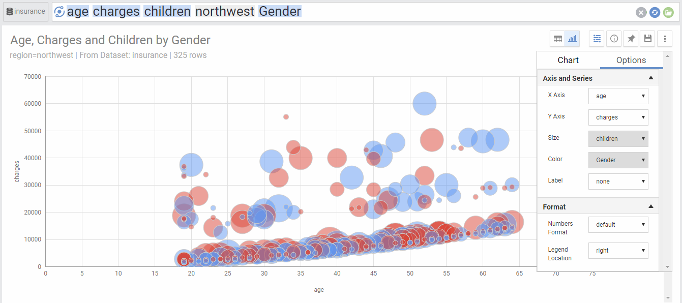
Adding another dimension will show colored bubbles based on the values of the dimension.
Instead of adding a dimension, we can add a fourth metric to the three existing ones. This will also use color to represent the 4th metric. Since the 4th metric is numeric, AnswerDock will use a color scale to represent the values of the 4th metric:
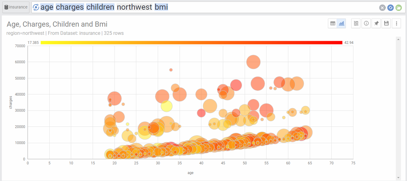
Chart Options
| Option | Explanation |
|---|---|
| X Axis | The Metric used for X axis. |
| Y Axis | The Metric used for Y axis. |
| Size | The Metric used for the size of the Bubble. |
| Color | The Dimension used to segment the bubbles by color. |
| Label | The Dimension used for the label of each bubble. |
| Numbers Format | Change the format of the numbers used in the Axes and on-hover data call-outs of the chart. |
| Legend Location | Select the location for the legend that shows the color coding of the bubbles. |