Summary: Line charts are very useful for Time Series Analysis, showing trends of metrics over time.
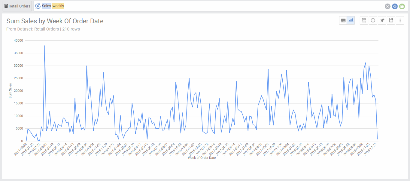
Line charts are very popular charts since they can show the growth direction of your metric. They are usually used for Time Series Analysis. They display the data as a series of lines connecting different dots accross the X axis.
Your data needs to have one dimension and one metric to be represented in a line chart.
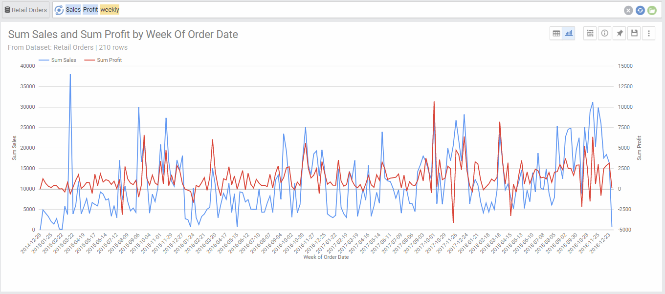
Line charts can also have multiple metrics, which will show each metric with a line having different color.
Line charts can also have 2 dimensions, in this case the first dimension will be on the X axis and the second dimension would be represented by multiple Lines with different colors (we call these series). This is a great chart to see performance of different segments over time.
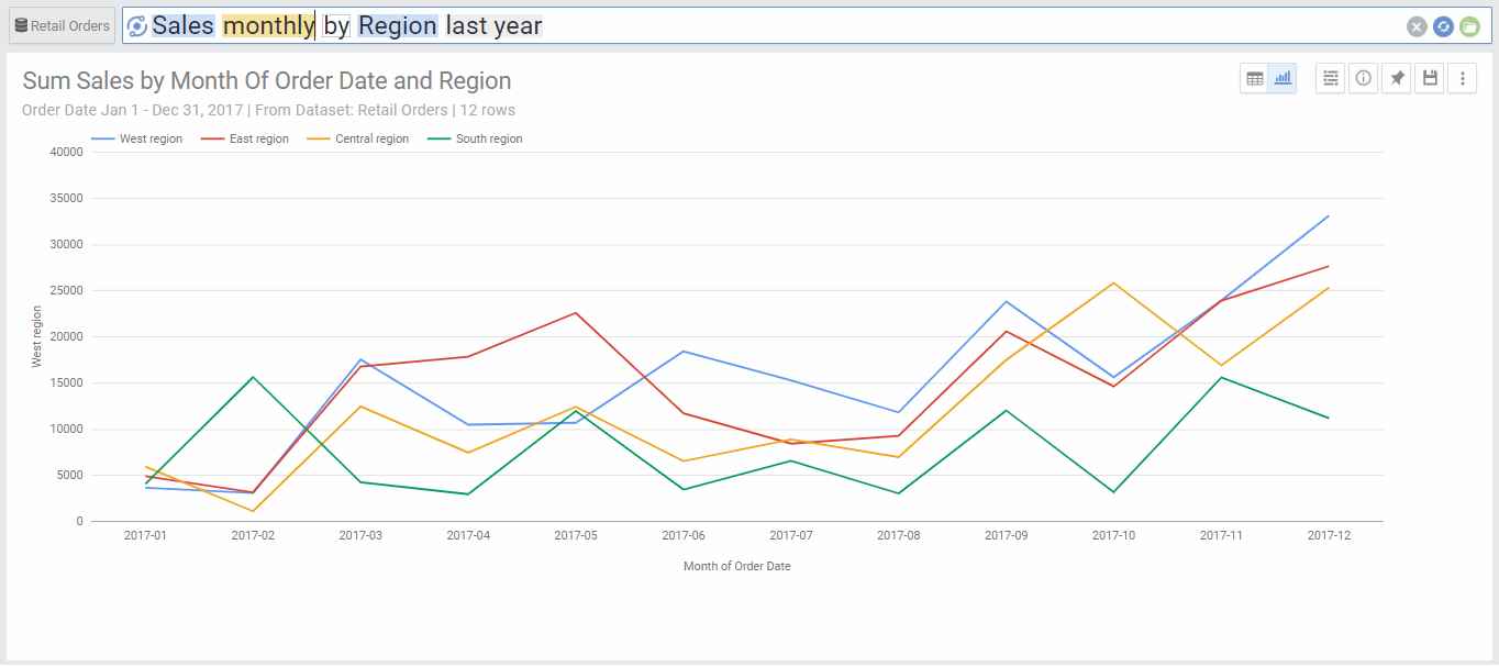
Chart Options
| Option | Explanation |
|---|---|
| X Axis | The Dimension used to populate the X axis values. |
| Series | This will show the values of the segments of the second dimension (each will be drawn in a different color). |
| Switch X-Axis/ Series | Provides an alternative view of the chart by switching between the dimension used to populate the X axis and the one used to populate the stacked segments draw with different colors. |
| Show Trend Line | Select the series or the metrics that you would like to draw a linear regression line. This is useful to see the overall trend of your data, whether growing or declining. |
| Show Data Labels | Will show numeric data labels for each data point in your chart. |
| Numbers Format | Change the format of the numbers used in the Axes, data labels and on-hover data call-outs of the chart. |
| Legend Location | Select the location for the legend that shows the color coding of the colored stacked segments. |
| Curved Lines | Will show smoother curved lines linking the data points, instead of the default straight lines. |
| Show Points Markers | Will show a dot for each data point |
| Sort X-Axis | Select the value by which you would like to sort the X axis. This can be the X axis dimension or the value of any of the segments from the second dimension. |
| Sort Order | Choose ascending or descending order. This is only available if you select a value to sort by in the previous option. |
| Limit X Axis Values | This limits the number of values that are drawn across the x Axis. By default, there is no limit. |
| Show Other category for X Axis | This aggregates all values that fall beyond the limited number of X Axis values into one category called “Other”. This is useful for charts where the higher values are consolidated within the first few segments, as it will aggregate all other segments into other and show as a separate point in the graph. This option is only available if there is a limit set to the number of X axis Values. |
| Rows Per Page | Allows to separate the chart into pages. You can go to the next or previous page by the links on the top right corner of the chart. |