Summary: Difference Bar Charts are a variation of column charts that are useful to compare a value of a metric between two difference segments.
Difference bar charts are the same as difference column charts, but they show bars horizontally as below:
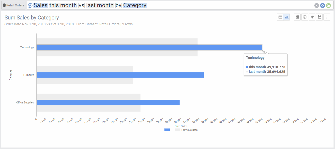
Chart Options
| Option | Explanation |
|---|---|
| Y Axis | The Dimension used to populate the Y axis values. |
| Series | If there is one metric only, this will show the metric used. If there is a second dimension, this will show the values of the segments of the second dimension (each will be drawn in a different color). The chart will always have only 2 values to compare between them. |
| Switch Inner and Outer Columns | This switches the fields designation of the inner (blue) and outer (grey) columns |
| Numbers Format | Change the format of the numbers used in the Axes, data labels and on-hover data call-outs of the chart. |
| Legend Location | Select the location for the legend that shows the color coding of the colored stacked segments. |
| Sort X-Axis | Select the value by which you would like to sort the Y axis. This can be the Y axis dimension or the value of any of the segments from the second dimension. |
| Limit Y axis Values | This limits the number of values that are drawn across the Y Axis. By default, there is no limit. |
| Show Other category for Y axis | This aggregates all values that fall beyond the limited number of Y axis values into one category called “Other”. This is useful for charts where the higher values are consolidated within the first few segments, as it will aggregate all other segments into other and show as a separate point in the graph. This option is only available if there is a limit set to the Y axis. |
| Rows Per Page | Allows to separate the chart into pages. You can go to the next or previous page by the links on the top right corner of the chart. |