Summary: Table Heat Map charts use a color scale to visually show segments with higher or lower values.
Table Heat Map charts represent the data in a two dimensional table. You need one metric and two dimensions to use the Table Heatmap chart. The cells of the table show the metric value and are colored by using a color scale. The darker colors representing the higher values.
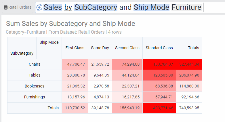
Chart Options
| Option | Explanation |
|---|---|
| Heatmap Type | Heatmap: This is the default option. It will color the cells based on their relative values across the whole table. |
| Row Heatmap: This will color the cells based on their relative values within each row. | |
| Column Heatmap: This will color the cells based on their relative values within each column. | |
| Numbers Format | Change the format of the numbers used in the Axes, data labels and on-hover data call-outs of the chart. |