Summary: Pie and Donut charts are useful to show breakdown of a metric across different segments of a dimension.
The Pie and Donut charts are similar to each other but with a slightly different visualization. You data needs to have one dimension and one metric to be represented by a Pie or Donut chart. These charts are used to show percentage and they are often the default visualization if your questoin or search has a Percentage Keywrod.
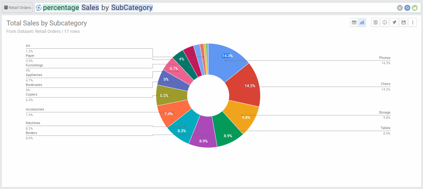
Chart Options
| Option | Explanation |
|---|---|
| Numbers Format | Change the format of the numbers used in the data labels and on-hover data call-outs of the chart. |
| Legend Location | Select the location for the legend that shows the color coding of the colored segments. |