Summary: You can change the default chart and amend its settings from the chart selection and settings menu. Available charts depend on the data returned by the answer to your question.
Changing the Chart Type
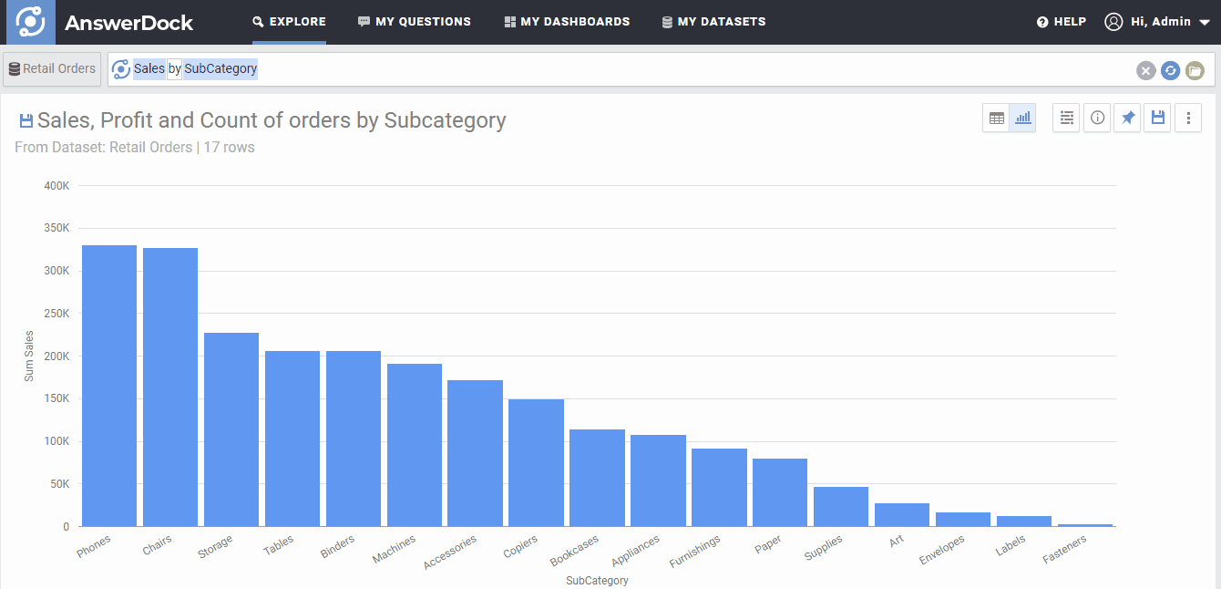
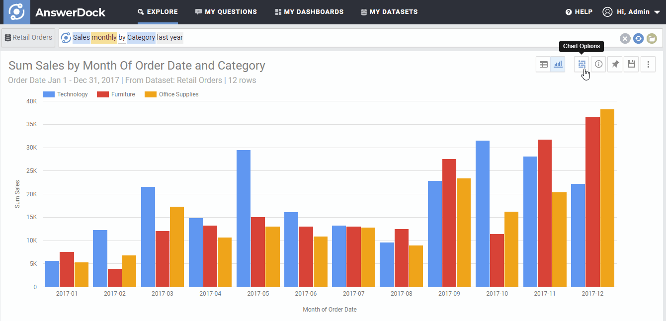
AnswerDock has more than 25 charts available to visualize the answer. You can change the default visualization from the charts selection menu on the top right of the answer area.
According to each question, some charts will not be available if the data returned does not fulfill the requirements for that specific chart. As an example, for our example of “Revenue by country monthly” the pie chart will not be available, as this type of chart can only fit one metric and one dimension, and in this case we have a metric (revenue) and two dimensions (country and the date interval).
Customizing Charts
AnswerDock has more than 50 different customization settings that can be applied to charts to better visualize the answer. These include the sorting and limiting of the data displayed, showing data labels, showing trend lines, changing numbers format, and other options according to the selected charts.
Note that when a setting is changed for a chart, the setting will stick for the subsequent charts used (if you change the chart later). The settings will be reset when you open a new explore tab, or when you clear your search.
The next section explains every chart and the required data elements (number of metrics or dimensions) needed for it, as well as the different charts settings that can be modified for each chart type.