Summary: Line with Column charts are a combination of column chart and line chart. You can use them to draw 2 metrics across one or two dimensions
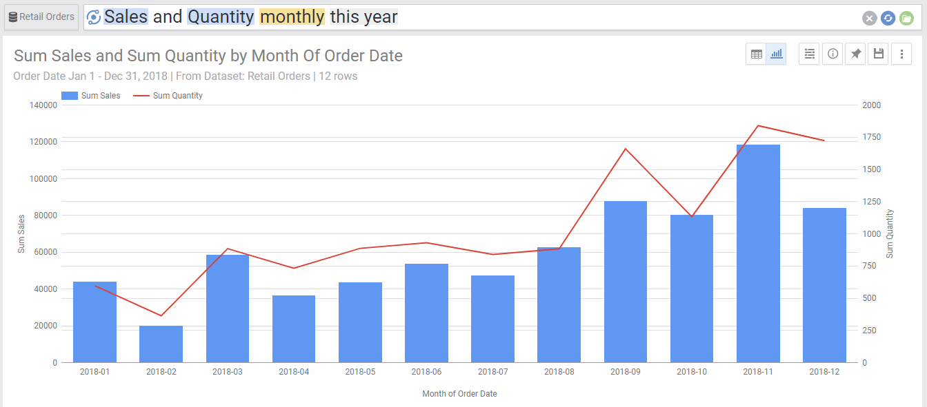
Line with column charts are used to draw two metrics, one represented by a column and the other by a line. This is useful when we need a visualization that clearly differentiates between the two metrics. You need at least two metrics and one dimension to use the Line with Column chart:
Line with Column charts can also have 2 dimensions and 2 metrics. In this case, the first dimension will apply to both metrics (using the X axis) and the second dimension will only apply to the first metric, drawn as columns with different colors. The second metric will only be represented as an aggregate for each point of the X axis. For example, below is the above chart after adding the category dimension
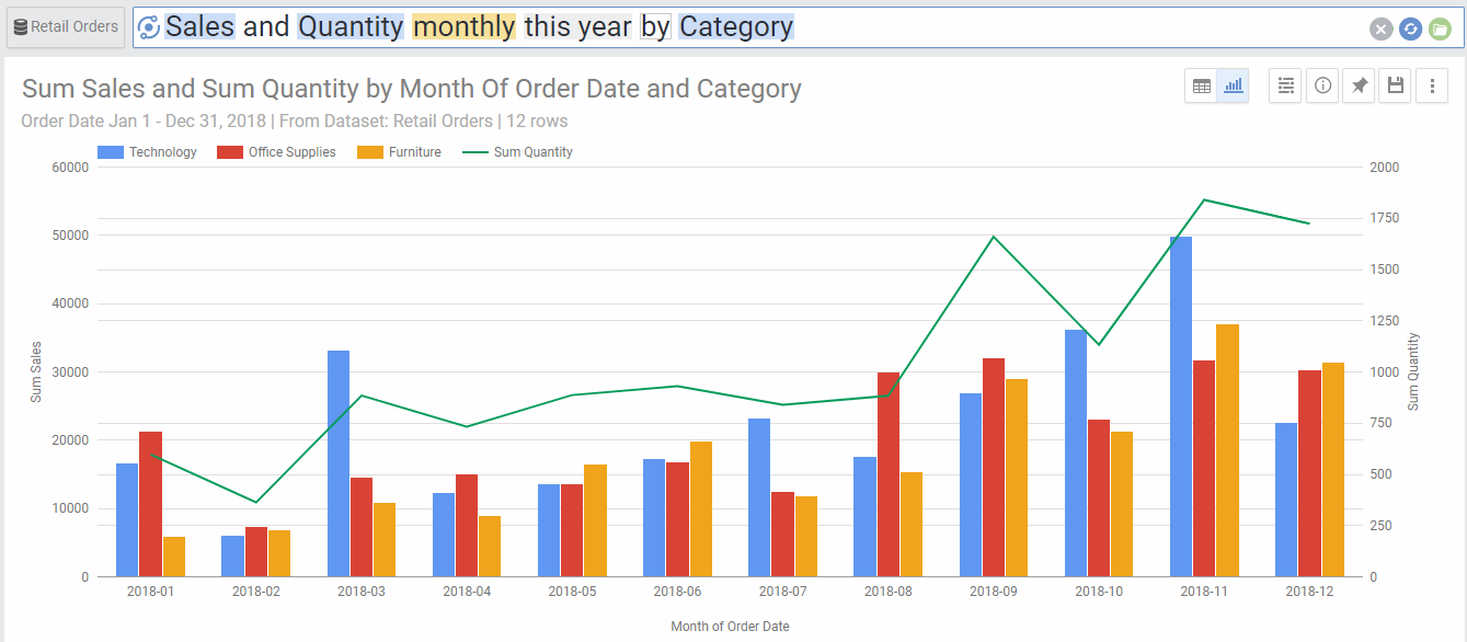
Chart Options
| Option | Explanation |
|---|---|
| X Axis | The Dimension used to populate the X axis values. |
| Series | This will show the values of the segments of the second dimension (each will be drawn in a different color). |
| Switch X-Axis/ Series | Provides an alternative view of the chart by switching between the dimension used to populate the X axis and the one used to populate the stacked segments draw with different colors. |
| 2nd Y Axis | Choose the metric to be represented with a second Y Axis on the right. This is useful when the two metrics represented by a column and a line have different data ranges. |
| Line | Choose which metric to be represented by a line. By default this will be the second metric in the data returned.Alternatively, you can also select one of the below two options: -Average:This will draw a line if the average at each point in the X Axis. -Overall Average: This will draw a straight line across the whole chart with the average value of all data points. This is useful to see which data points are above or below average. |
| Show Data Labels | Will show numeric data labels for each data point in your chart. |
| Numbers Format | Change the format of the numbers used in the Axes, data labels and on-hover data call-outs of the chart. |
| Legend Location | Select the location for the legend that shows the color coding of the colored stacked segments. |
| Curved Lines | Will show smoother curved lines linking the data points, instead of the default straight lines. |
| Show Points Markers | Will show a dot for each data point |
| Sort X-Axis | Select the value by which you would like to sort the X axis. This can be the X axis dimension or the value of any of the segments from the second dimension. |
| Sort Order | Choose ascending or descending order. This is only available if you select a value to sort by in the previous option. |
| Limit X Axis Values | This limits the number of values that are drawn across the x Axis. By default, there is no limit. |
| Show Other category for X Axis | This aggregates all values that fall beyond the limited number of X Axis values into one category called “Other”. This is useful for charts where the higher values are consolidated within the first few segments, as it will aggregate all other segments into other and show as a separate point in the graph. This option is only available if there is a limit set to the number of X axis Values. |
| Rows Per Page | Allows to separate the chart into pages. You can go to the next or previous page by the links on the top right corner of the chart. |